Monday, 11 November 2013

OUGD504 - Design For Web (1)

In the first studio session we did brain storms of the content we got over the summer brief and narrowed it down to what we wanted to include in our websites/what we could include in our websites.
After doing this, we were told that we had to have a minimum of five pages for the website.
I decided on the following five pages:
  • Homepage
  • History of type
  • Hand drawn vs digital
  • Anatomy of type
  • Type videos
I also began researching into website layouts to help decide the overall visual look of the pages.
After doing this & the following studio session I finally decided on a layout for each page and drew them out as scamps. For the web design session we needed 3 variations for the homepage, and then for the studio session we needed a storyboard of the website as a whole.
Homepage variations
Page scamps
For a more visual plan I started working on the homepage and what the visual elements were going to be. I want an overall minimal aesthetic, so just a plain white background with only the website title and navigation bar, which are all done to look like they are hand-drawn.
I started with the layout for the title as this is the main thing on the from page, and decided on the first design because it is the most balanced design in my opinion. None of the text is at too much of a small size.
I then used the same typeface to write the five headings for the navigation bar. I printed these out and hand drew them out. I wanted each to be individual and have their own style, so made an effort to differentiate the designs, while keeping them in a uniform look with the typeface they're based on.
Hand drawn type
To put it on the website these all need to be in a vector format, so I traced around them. I think it worked well, keeping the hand drawn look of them while looking computerised. 
Website title
Navigation buttons
I found that the titles for each page of the website were quite long so I changed the placings of the words to be more compact so they would fit along the bar and be at a more readable size.

Reformatted navigation buttons
I then took these into Illustrator and mocked up an idea for the home page to get a visual instead of a rough idea. I think overall it works quite well, but the navigation bar does seem quite cluttered so I might need to rethink this, especially because the hand-drawn designs on the lettering is quite small, so I can't make them too small otherwise it won't be easily visible.

OUGD503 - Studio Brief 1: Competition Brief 2: Pickled Pelican

Pickled Pelican - Food Label
Brief:
Gourmet range of REAL jams, relishes,candies cookies etc
Rustic slightly vintage old school needs to suit a variety of bottles happy to change the pelican to fit with this image
My response:
This brief is obviously very short, which made it really very open with not much of an idea of what the contestant holder actually wanted.
From the brief I created the following response:
The contest holder added a note asking for a stamp to be created too, so I created that along wit the label design.
My entry entered
I was given the following feedback from the contest holder for my design:
From this I did what they asked, which wasn't exactly what I wanted to do, but if it's what the client wants then it has to be done.
I created the following response:
I also created a second design which was the same but with a smaller height.
The contest holder preferred the second design, giving the following feedback:
From this I did the following changes:
Designs entered 
From the last one entered I was given 5 points of feedback:
I carried out these changes:
I was given the following feedback:
This was a little bit annoying because the feedback was the opposite of what she had asked for previously, so it felt a bit like going in circles.
I carried out the changes she wanted and made the following:
After this I was given a further amount of changes to do:
I carried these out:
Final design
After all of that I was awarded the winner of the contest.
Once I had done this I had to hand over the files and agree to the terms & conditions.
Initially I entered this brief because there weren't many designs entered, and the ones that were weren't exactly spectacular so I thought I was in for a good chance of winning it.
It was also a chance to work from a brief which was very brief to say the least, and was clear that the contest holder didn't really have much of a clear idea of what they wanted.
This brief also gave me the insight into how a client might want something that I, as a designer, will think is completely awful and make me wonder how on earth they could possibly want that as a design for their products. I personally still stand by my original design, but I suppose at the end of the day I won the competition and the money so I can't complain so much.

Thursday, 31 October 2013

OUGD503 - Studio Brief 1: Session 1

  • Look for 5 briefs with a time limit within the module deadline - need to be 5 substantial briefs
What do I want to get out of this module?
  • Improve presentation skills/quality
  • Improve quality of concept proposals/ideas
  • Confidence in submitting to live briefs
  • Improving working with concepts & carrying it through
  • Work confidently with clients
  • Design work which has the possibility of being used commercially
  • To design a wide range of work & improve my skills in all aspects of design
  • Experience working on competition briefs/live briefs
  • Time management & discipline
  • Understanding realistic timescales
  • Effective professional communication
  • How not to get exploited & getting paid
  • Identify individual practices
  • Brief analysis
  • Creative compromise
  • Exposure
  • Portfolio development
  • Contacts & opportunities
Why do I think live/competition briefs will be useful?
  • Experience working for something real
  • Experience working for a client & with client vision
  • Work on briefs that you wouldn't have necessarily done before/areas of design you haven't had so much experience in
  • Potential to gain exposure & get work from it
  • Cash prize
  • Improve portfolio
  • Improve professional design skills
  • Challenge of a professional brief
  • Commitment to being more than just a student
  • Developing clearer/more effective working practice
  • Real world benchmarking
  • Contacts
  • Professional feedback
  • Professional experience
Why have I chosen the briefs?
  • different range of outcomes for each & a range of problems
  • Possible placement opportunities
  • Exposure
  • Range of skills needed
  • Personal interest/interest in the content
  • Where my strengths lie
  • Short & simple
  • Free to enter
  • Prize
  • Creative freedom/scope
YCN brief - LEGO
  • What is the problem?
Brand confusion - consumers are thinking that competitors products are lego
  • What is the brief asking you to do about it?
A promotional campaign showing lego and what is good about it/the differences between its products and those of the competitors
  • What is the brief trying to achieve?
A clear campaign so consumers know what products are lego and what products are not. A rejuvenated brand identity.
  • Who will benefit?
Lego & the children.
  • What is the message?
Lego is the best company in the market and makes high end, good quality products.
  • Who is the audience?
Parents of young children.
  • How will the message be delivered?
Visual campaign.
  • Can you foresee any problems with it?
Outcomes aren't specific.

Task: Identify a brief with a substantial scope for development and answer the following:
  • Why have I chosen it?
  • What do I want to make?
  • What do I need to make?
  • What do I want to get out of it?
Also answer the questions above and begin initial concepts/ideas.

Chosen brief:
YCN competition brief - Domino's Pizza
Create a campaign that will reassert Domino's ownership of Tuesdays in the pizza takeaway category.
  • Why have I chosen it?
The creative challenge was one that I am quite interested in and I thought this brief was much more open and creative than some of the other briefs I could have chosen.
  • What do I want to make?
A series of large scale posters.
  • What do I need to make?
A campaign using any specific medium, or a combination of media that will best connect with the audience in the times and places they will be most receptive to it.
  • What do I want to get out of it?
I want to be able to come up with an initial concept and stick with it throughout the whole project. I want to do something creative and not just the same old thing, something different from my usual practice.
  • What is the problem?
Consumers are overlooking Domino's 'Two for Tuesday's' offer.
  • What is the brief asking you to do about it?
Create a visual campaign to get Domino's ownership of Tuesday's.
  • What is the brief trying to achieve?
A clear creative campaign that shows consumers that Domino's is there and is doing this offer every Tuesday.
  • Who will benefit?
Domino's & the consumer
  • What is the message?
Tuesday is Domino's pizza takeaway night.
  • Who is the audience?
18 - 34 year olds of both sexes, many of whom are students
  • How will the message be delivered?
In the form of a visual campaign over a variety of media, or just one specific medium.
  • Can you foresee any problems with it?
There is no specificity to the brief. It is asking to rejuvenate the 'Two for Tuesdays' offer, but not giving any indication into how.

Wednesday, 30 October 2013

OUGD503 - Studio Brief 1: Competition Brief 1: Glacier Coffee Roasters

Glacier Coffee Roasters - Identity & Logo
Brief:
Glacier Coffee Roasters, a startup company which is inspired by Glacier National Park and animals living there, is aiming for providing high-quality coffee through "Third Wave Coffee" movement, like Stumptown and Intelligentsia.
Target audience is coffee drinkers looking for a better cup of coffee and enjoy different flavors from various coffee producing countries.
We are open to all kinds of designs and ideas. Thanks in advance for your efforts. We believe that it will be fun working with you talented designers.
Logo must be associated with Rocky Mountain goat (Oreamnos americanus), which is the symbol of Glacier National Park. It can be a baby, a mother or both.
Coffee elements, like coffee beans, cups, portafilters, latte art, etc are not required. Use them if they look great with the logo.
We plan to have our company logo (or part of it) printed on Nuova Point blue PALERMO coffee cups (COLOR:http://www.nuovapoint.com.au/blue_milano.php) & (SHAPE:http://www.nuovapoint.com.au/palermo.php). Please make sure the design can go well with it.
We are looking for an iconic brandable logo. The logo should be applicable to different subjects like coffee bags, signages, coffee cups/mugs, walls, websites, etc. Because of the multiple purposes, it has to look good on black/dark backgrounds and white/light backgrounds. Variations of the same design will be great. And It should be easily resizable, should be identifiable when relatively small.
 My response
From the brief set, the main things I have taken away from it is that they want:
  • A logo - something that can be reproduced on cups/other media
  • Use of a mountain goat
  • Look good on dark or light backgrounds
  • Colour variations of the same design will help
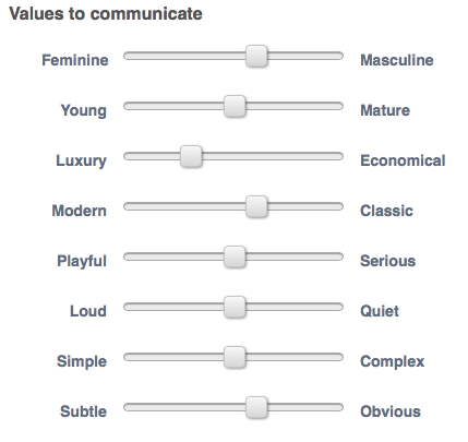
The values they want to communicate aren't exactly helpful because they are 50:50 on the majority of them, so at the end of the day, it'll be down to what they as judges personally like.

I drew out some initial ideas as a starting point.

From here I chose the one which I thought was going to be visually strong and something that other people may not think about. I decided on choosing the one in the bottom right as it plays on negative space.

I took this idea into Illustrator and created the initial design.
For the starting point I'm happy with it. The mountain is very defined which is good. When creating this I didn't think it'd work that well, but now it's finished it has worked out the best out of everything and is very clearly a mountain.
What needs changing is the typefaces I am using and the outline of the goat.  The outline isn't a particularly definitive shape for the goat. It wouldn't be that obvious to someone who saw it for the first time. The typeface isn't particularly exciting. It is a little bland and doesn't stand out really, so I need to find one that is a bit more exciting.
I'm also not happy with the shape it makes. It seems to stop quite abruptly, so I would like to have something that brings it all together and makes it obvious that it is a logo.

Taking all of these things into account I created the following:

I changed the outlined goat into a silhouette and moved the position. It works a lot better as it is a lot clearer what it is. Adding the circle to it also makes it seem a lot more like finished and like something that could be used.
The brief writer wrote a note saying for designers to try more colours other than black and white and to try brighter more adventurous colours as a whole, so I did a few variations as shown above. They show that this can work in a variety of different ways with colour, having it all the same colour, or having it in multiple colours.

Following on from this suggestion from the contest holder, I decided to go in a more contemporary direction to see if there was anything else I could do which was better and incorporate a number of colours.
My response is shown above. Initial thoughts are that it is completely different but works well. I'm not too pleased with the typeface used for the title, and the bottom bit of text reminds me of the Starbucks logo, so that's something that I need to change. However I do like the colours used and the overall aesthetic look of the logo. It is a lot more striking as an image than my previous designs and the simplicity of the shapes works well.

From this I continued to work on it. The first thing I did was get rid of the bottom line of text and change the typeface and positioning, getting rid of the green area all together.
I changed the overall shape of the design so it was a semi-circle shape. It is a lot more distinctive. I also changed the title typeface back to the one I was using previously, and this works a lot better with the secondary typeface and fits in with the image design.
The contest holder also asked for it to be shown is different forms so I took the goat and created a couple more options to what it could potentially look like.


I can't say I'm particularly happy about how these turned out, but they are development. At least I know what I don't want to do.
I decided to stick with the original shape, scrapping the other two.
The next thing I did was change the colours. They are a little bit dark and don't look as clean as they could be. I have used too much colour on them so I wanted to get rid of the unnecessary colours.
I changed the blue so it was lighter and got rid of the cream colour altogether (apart from in the goat), and changed the text so it was in black again. This works a lot better as an image as it looks a lot more sophisticated.
I was happy with this design so decided on this one being the one I would enter. I did three colour variations of it just to show the different colours which could be used, keeping it open for the contest holder to see this.
Final entry
My entry entered
My design didn't get shortlisted, but that doesn't particularly bother me because the whole point in entering this was to do just that. I didn't expect it to go any further than me entering it.
I chose this brief because I hadn't done much branding, and this incorporates both text and image working together. 
I did this one in particular because the concept interested me and I thought it would be a good one to test myself on and see how much I could develop my designs from the initial design stages. This brief was also quite well written, which is more than can be said for a lot of the others on this website.
I feel a lot more confident in entering these design competitions after doing this because even though I didn't get short-listed at least I did enter and it's really not as much of a big deal as I initially thought.

OUGD503 - Studio Brief 1: Preparatory Task 1


Task: Look into Live briefs and find 5 that I would like to enter
1 - Design a 7" vinyl for Keane
I have chosen this brief because I have a big interest in music and music artwork. Working on something like this for a very well known band is an opportunity that I didn't want to pass up. It is also quite an open brief with freedom which will allow me to be more creative than other briefs would.

2 - Design Lyric Artwork for The Royal Concept

I decided to choose this brief because of it's emphasis on using typography. Typography is something I am more comfortable using over image, and I think choose briefs like this will work to my advantage. It is also an open brief, only asking for a small amount, so I will be able to be creative.

3 - Design new logo for Glacier Coffee Roasters

I have chosen this brief because it is in branding and identity and this is something that I would like to improve my skills on as I feel I haven't done much in this area and there is a chance to make myself a more rounded graphic designer.

4 - Typoday poster design

I have decided to do this brief because it is a purely typographical brief, with an interesting twist to it which will need a lot of thought and work put into it. A couple of the briefs I have chosen are short, small ones, so having a larger, longer one is something that I can spend time on and develop.

5 - Tiger Print Card Design

I have chosen this brief because it seems like it is quite a fun, playful brief which will be quite relaxed. It also gives me the chance to work commercially as the winning design will be sold in M&S.

Tuesday, 29 October 2013

OUGD504 - Design For Web: Studio Session 3/Study Task 6

Session 3 29.10.13
In this session we were focussing on navigation through a website.
The first thing we did in groups was make a list of common navigation and uncommon navigation.
After discussing this as a class, we were then given the task to apply it to our websites that we are to design. To do this we were told to create flow diagrams of how we want the pages to navigate/link to.
For my website I want a menu bar that will appear on all the page, linking them all together. This proved difficult in creating an easy to read flow diagram.
 My flow diagram:
 After doing this we were given the task of looking at the five websites we brought in and putting the layout grid over the top.
I then took these into InDesign and made the grids properly.